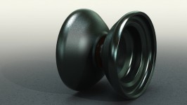
We decided to take a dive into the centerweight-trend and Frank began designing a new yoyo he called Nile. Here are his notes on the design along with a first CAD render image.
As many people suggested, I’ve designed a yoyo in the modern vein. More centerweight and thus higher RPM that is. Its all about getting the right balance between spintime and RPM. So we needed to shift some weight to the center to get higher RMP value.
So, here is our first dip into high RPM yoyos.
The Nile
Diameter: 56.00mm
Width: 44.00mm
Weight: 66.20g
Gap: 4.20mm
Response: Hot Red SILYYcone
Bearing: ILYY KMK metricAs you can tell, we have this typical yoyo in a yoyo design here. The inner rim area has a diameter 36.44mm the outer diameter of the inner yoyo is about 45mm. The whole rim stretches over 9.78mm. I’m not quite sure if this is enough to make a huge difference playwise. But we’ll see.
The rims have linear elements (parallel and collinear) that reduce visual tension. I was going for round lipped rims first but that way it got way too heavy. In order to maintain a small (diameter) inner yoyo, I had to cut away a part of the rim, thus it is flat now. I had difficulties getting the outer rim thin enough to shift enough weight to the center while still maintaining a good haptic. We had this issue with the fist Lynx prototype as well: it had too thin rims at the outermost point. Therefore it felt quite unpleasant and gave a cheap impression. Both rims might be useable for thumb grinds. However, this is just a design study, we have yet to try it out once it is machined.
A high wall (flat area around the response area) is more or less absent this time. That should prevent the yoyo from tilting too much if the strings are not perfectly parallel. I’m not into horizontal play, as a matter of fact, I can’t do a single horizontal style trick. But this feature should suite this playstyle well. Correct me if I’m wrong.
The profile turned out to be quite traditional, what is good for a competition yoyo, I guess. But basically it follows the inner shape (horn to rim). That’s quite a difference for me. Usually, I focus on the profile first. The inner area just arises from working out the desired weight. But this time, it’s different. The top area of the profile meets the rim in a Lio-ish kind of way. I really like that, it should result in a quite comfortable hold.
Overall, the design incorporates flat and curved surfaces, I tried to keep it as consistant as possible and threw in some linear parts here and there as you can see in the profile and from the horn to the rim.
I took some inspiration for the name from one of my favorite metal bands – Nile. I was listening to their music while designing the yoyo. The name also serves as great basis for an awesome engraving that has yet to be created. The Egyptian mythological theme will be realized by a certain coating or color way.
Prototype will be made in the next weeks. I hope to get it before the Christmas holidays.
By the way, any similarity to any existing yoyo is just coincidence. I intentionally did not look at yoyos that feature this particular style before I started designing. I wanted my design to be as unaffected by existing designs as possible. But as a matter of fact, yoyos tend to look more similar to each other than, say 2 years ago. The design features are nearly the same overall. That is especially true when it comes to a certain style of yoyos, as seen here with the centerweight/higher rpm focus.
So far…
Frank
More information will posted soon. Stay excited!

